Web
← All workBuilding a Brand That Disrupts
Transforming a generic corporate presence into a bold, cohesive brand that embodies innovation and federal modernization.
Summary
Steampunk positioned itself as a disruptive force in federal technology, bringing Silicon Valley innovation culture to government clients under the tagline "Design. Disrupt. Repeat." Its website didn't reflect that. Stock imagery and conventional layouts made it look like any other government contractor. With the company growing fast, it needed an identity as bold as its positioning, along with visual systems for Design Intelligence®, the Labs and Foundry innovation divisions, two client portfolios, and five practice areas. Each needed its own identity that still clearly belonged to Steampunk.
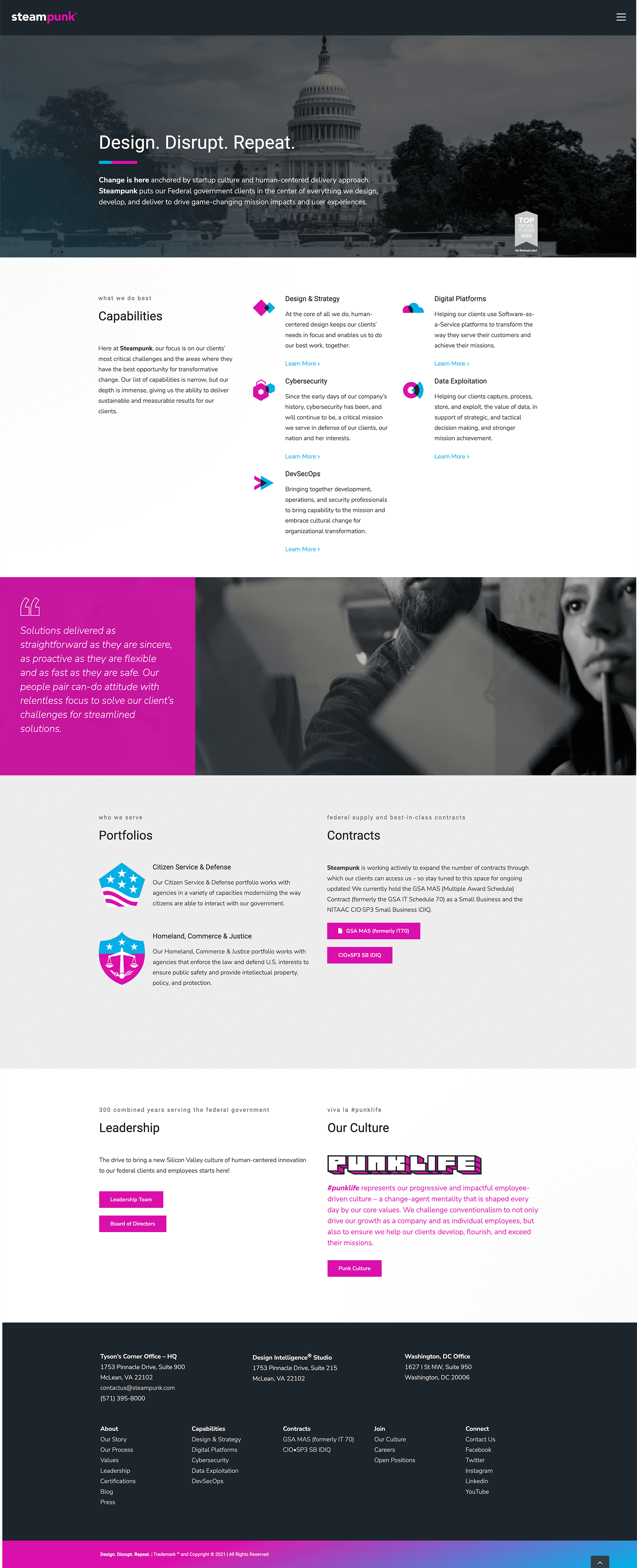
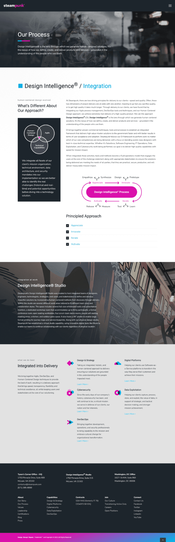
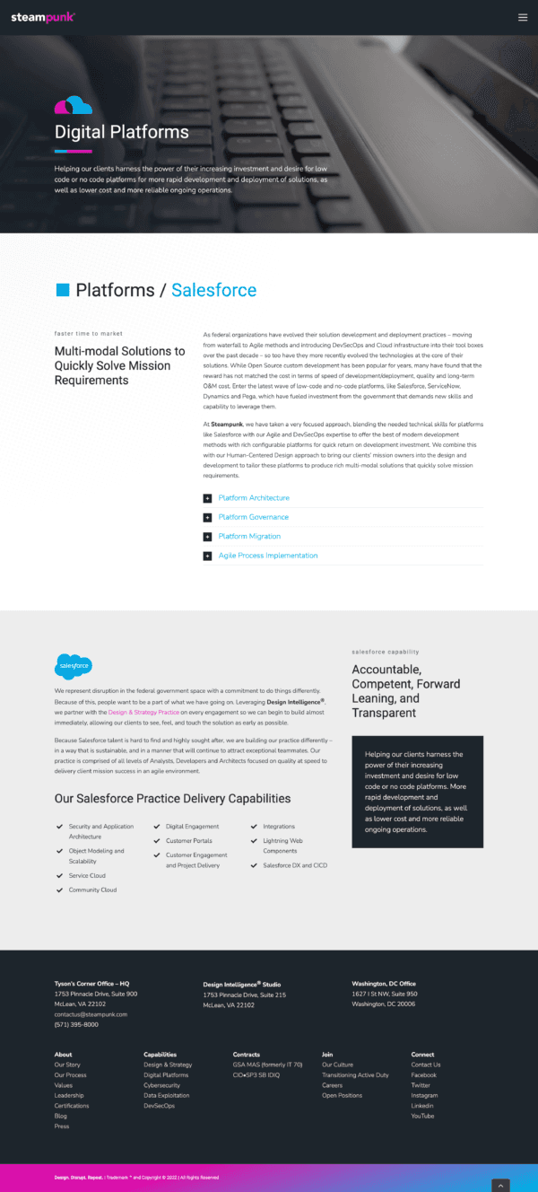
Working in a small internal design team alongside the Chief Marketing Officer and Chief Design Officer, I helped redesign the site page by page over six months. We couldn't rebuild from scratch, so we pushed the Avada theme to its limits to make it feel custom-built. Working one page at a time let us refine the system as it grew, with each page informing the next. The homepage set the tone with video of Steampunk teams at work and bold typography built around the tagline. Practice and portfolio pages got custom iconography and distinct visual treatments, and the whole site put Steampunk's #punklife culture front and center.
In parallel, we built brand guidelines covering logo usage, color, typography, iconography, photography, graphic elements, and voice and tone, written to serve internal teams, external partners, and print vendors alike. We designed logos and visual systems for Design Intelligence®, Labs, Foundry, both portfolios, and all five practices, and carried the brand into swag employees actually wanted to wear.
Outcomes
- From generic to distinctive. The site went from a template that could belong to any contractor to a cohesive brand experience that stood out in federal tech.
- One system for the whole company. Design Intelligence®, Labs, Foundry, two portfolios, and five practices each got their own identity under the Steampunk brand.
- Brand guidelines that scaled. Teams and vendors could apply the brand consistently without design reviewing every touchpoint.
- Stronger recruiting and sales support. The brand helped attract talent drawn to #punklife culture and gave business development a polished, energetic image to present.
- A brand employees wore with pride. Swag became a visible marker at conferences and industry events, sparking recognition and conversation.
Artifacts
- Website Redesign
- Brand Guidelines
- Design Intelligence® Identity
- Labs & Foundry Identities
- Portfolio Branding
- Practice Iconography
- Employee Swag
Methods
- Iterative Page-by-Page Redesign
- Stakeholder Reviews
- Brand System Development
- Visual Identity Design
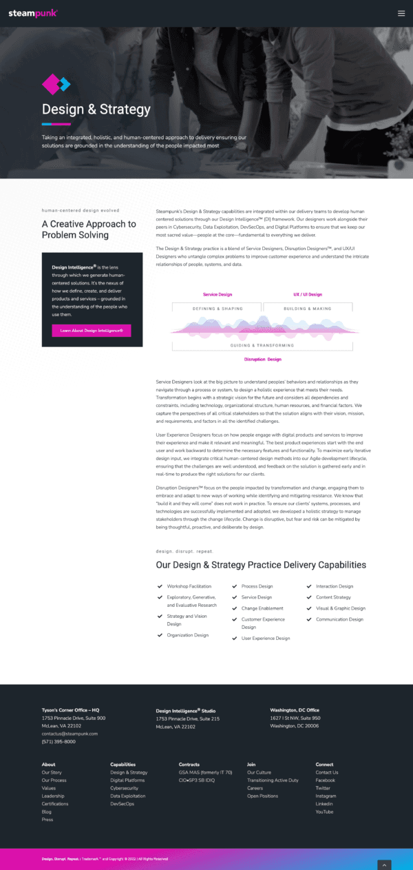
Mobile
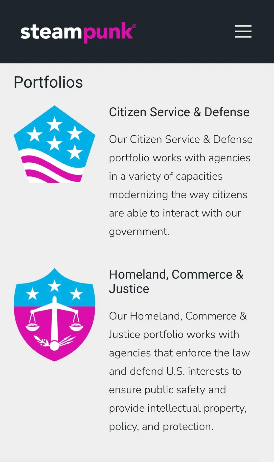
The redesigned site on a phone.
Portfolios
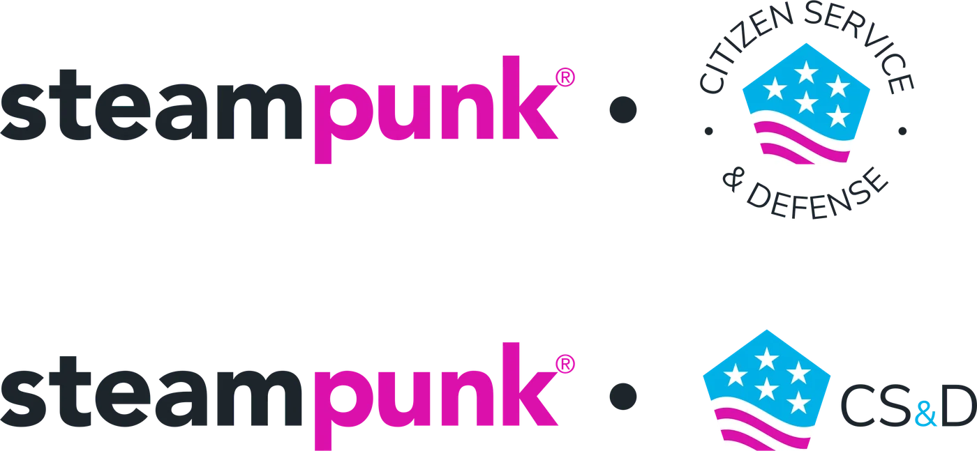
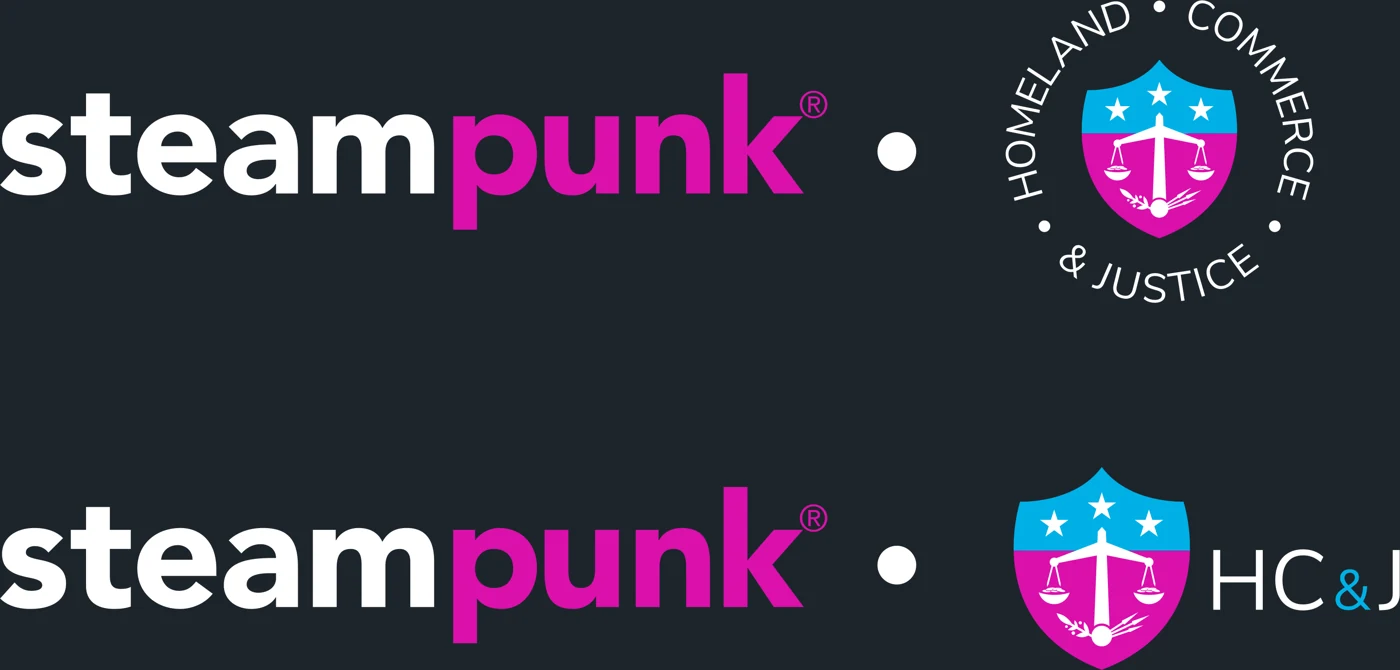
Seals and co-brand lockups for Steampunk's two client portfolios, Citizen Service & Defense and Homeland, Commerce & Justice. CS&D debuted first, in January 2021.

Labs, PunkU & Foundry
Identities for Steampunk's innovation and learning programs. Each one uses the same bold type and swaps in a single custom glyph.



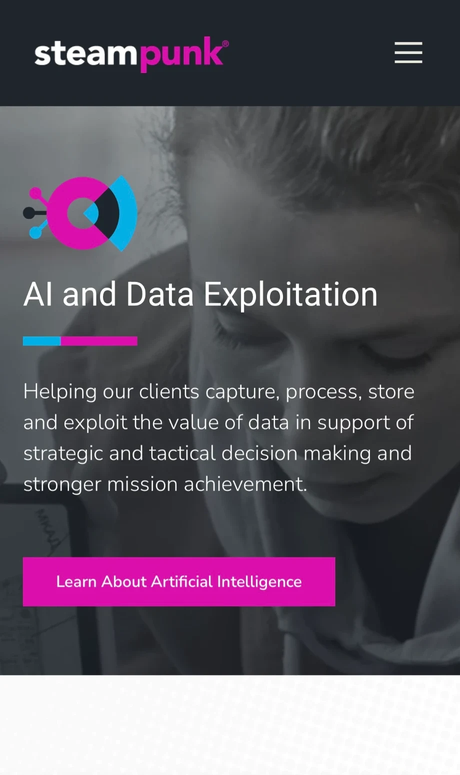
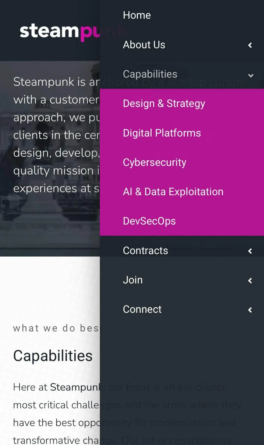
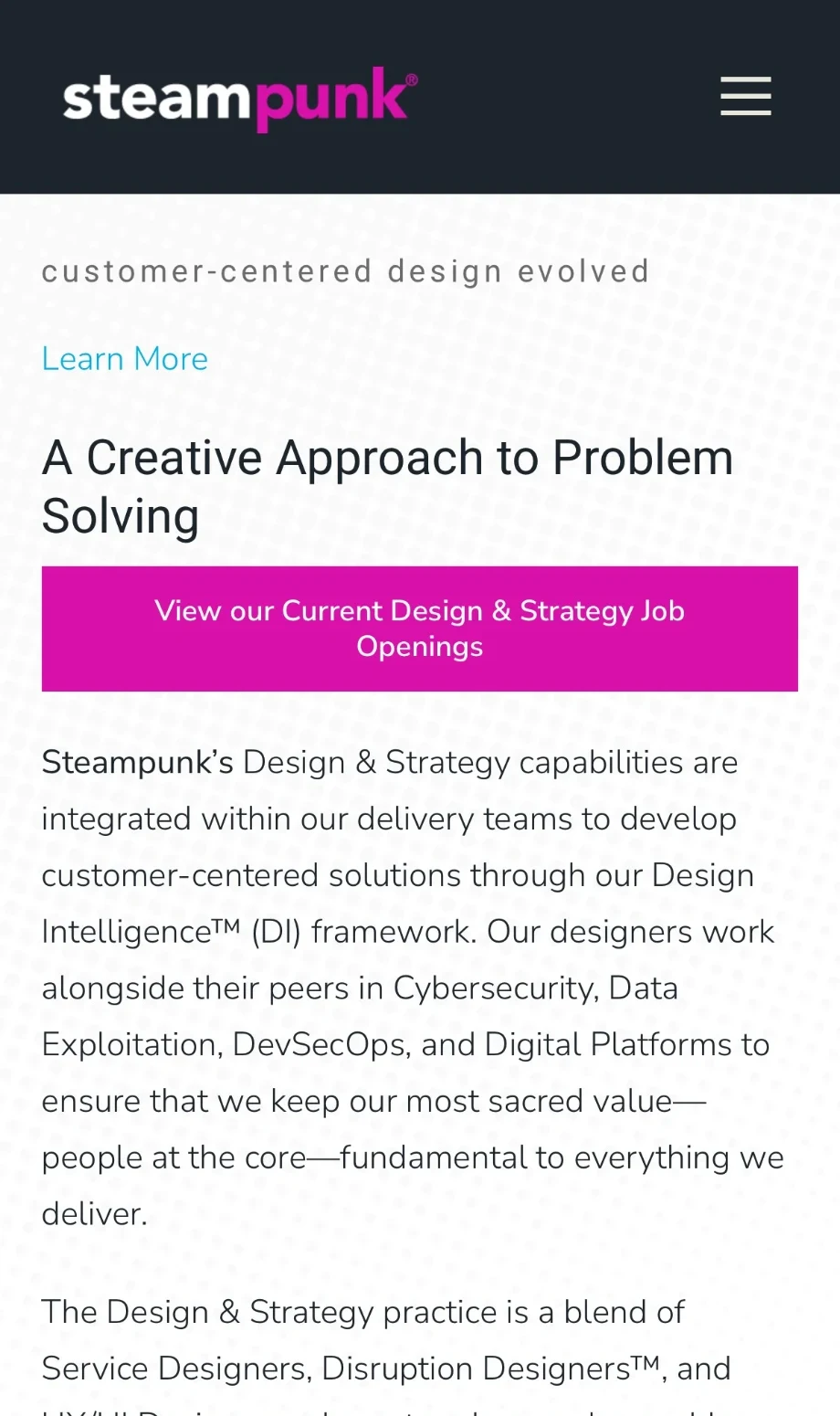
Capabilities
A matching set for the five capabilities: the same lowercase wordmark style, each with its own icon.





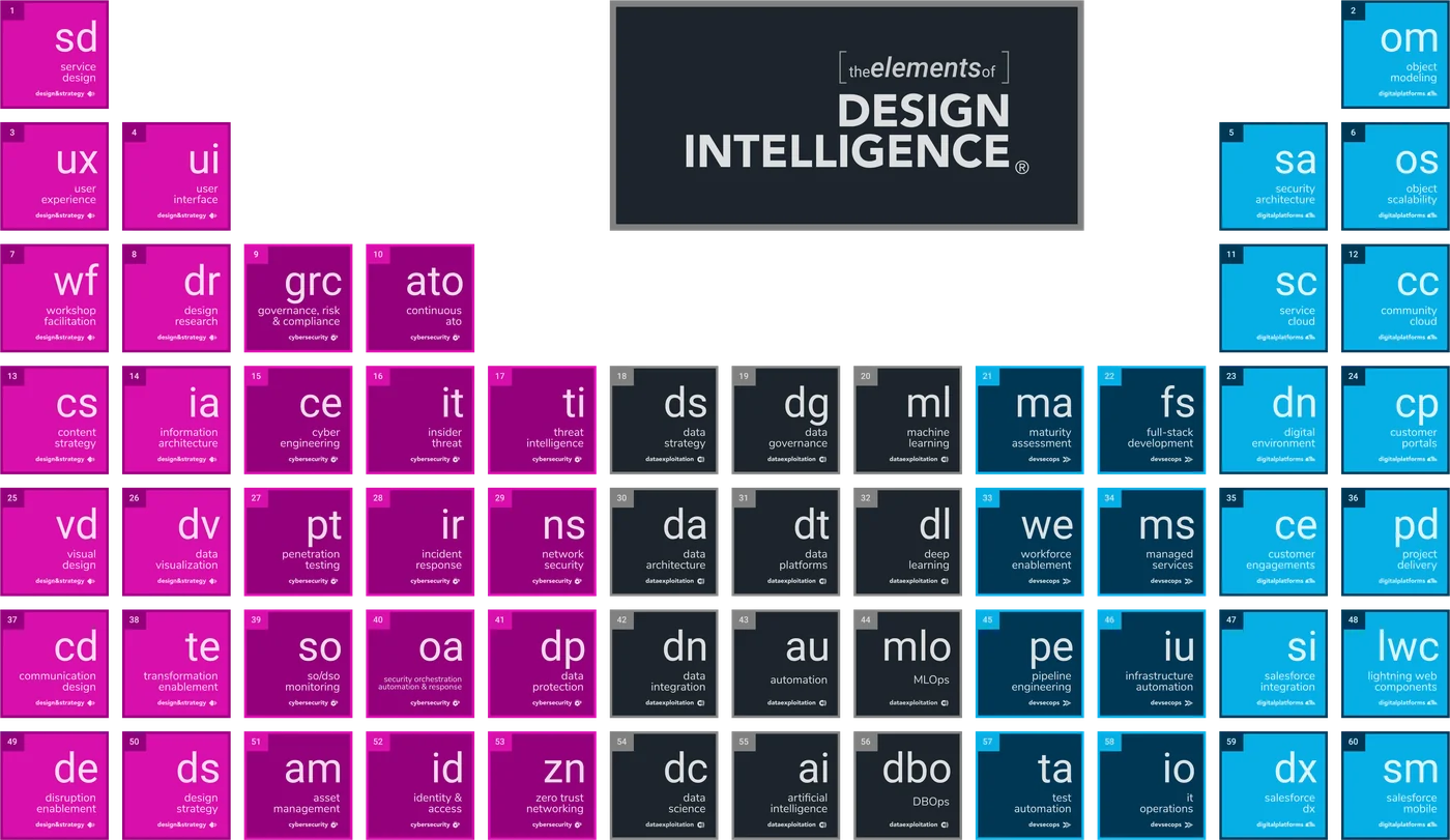
Design Intelligence®
Identity for Steampunk's human-centered design methodology, from the helix mark to a periodic table of design elements.