Visual
← All workWe Run This City
Designing a mobile app concept to connect athletes for pickup-style sports—from running to basketball to golf.
Summary
A video production company wanted to pitch Nike on an app that connects runners in a city: scheduling meetups, organizing run groups, and finding new running partners. Solo running can be isolating, and fitness trackers measure progress without addressing the social side that keeps people motivated. The company had the vision and the video expertise, but needed design help to turn the idea into something Nike could see and click through.
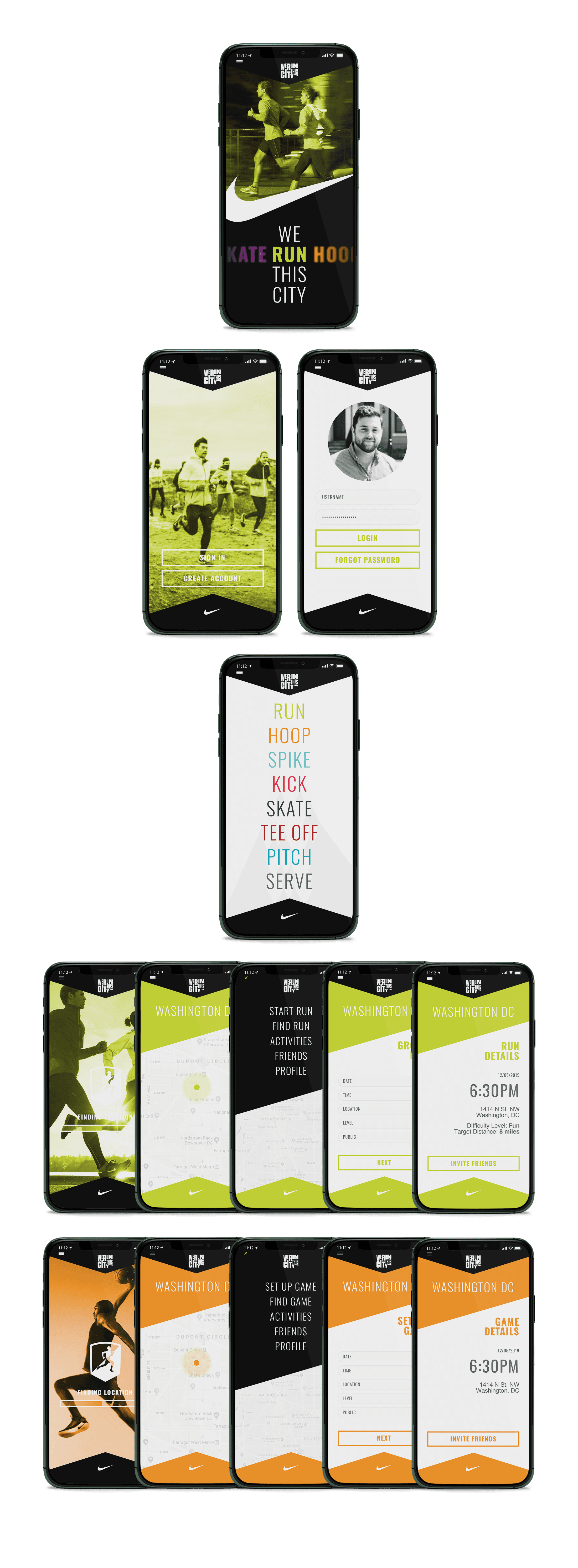
While designing the running flows, we realized the core problem wasn't specific to running. Basketball players look for pickup games, skaters want people to skate with, and golfers want new partners for a round. So the concept grew into a platform with a naming system to match: We Run This City, We Ball This City, We Skate This City, We Golf This City. A multi-sport platform could connect Nike with several sports communities at once and help users discover new ones.
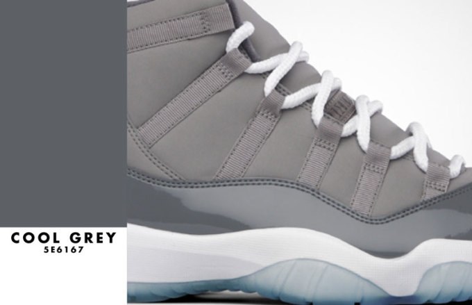
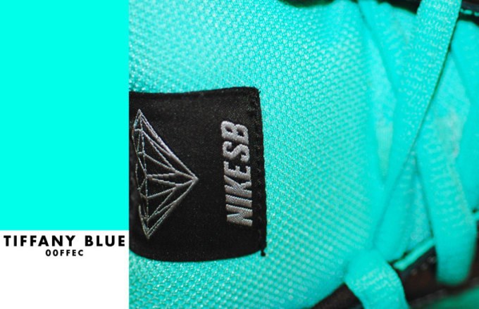
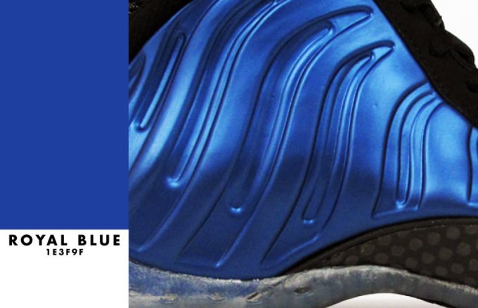
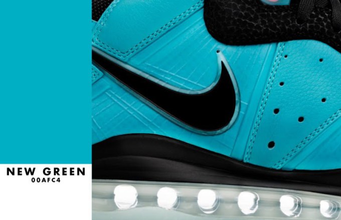
Mood boards established a visual identity for each sport, using Nike's typography and colors drawn from its most iconic shoes and apparel, so every version felt distinctly Nike while speaking to its sport's culture. We then built a clickable prototype covering onboarding and sport selection, browsing nearby activities, viewing meetup details, joining or creating an activity, and connecting with other athletes. The prototype became the centerpiece of the pitch, letting Nike stakeholders experience the concept instead of imagining it.
Outcome
- A single-sport idea became a platform. The concept expanded from one running app to a scalable system for any pickup-style sport, which made it a much bigger opportunity for Nike.
- A pitch Nike could click through. The interactive prototype gave stakeholders a tangible experience instead of static slides.
- A visual system that flexes by sport. Nike typography and product-inspired color palettes gave each sport its own identity under one brand.
- Delivered in two weeks. The fast timeline forced clear priorities and kept the concept focused on the essential experience.
Artifacts
- Mood Boards
- Sport-Specific Visual Identities
- User Flows
- Mobile App Designs
- Clickable Prototype
Methods
- Concept Development
- Mood Boarding
- User Flow Mapping
- Rapid Prototyping
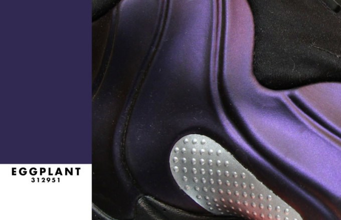
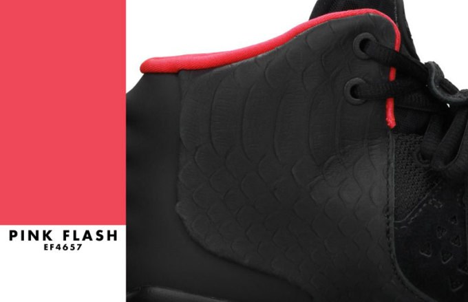
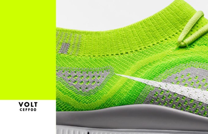
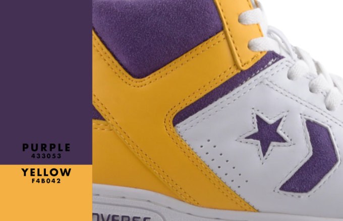
Color Inspiration
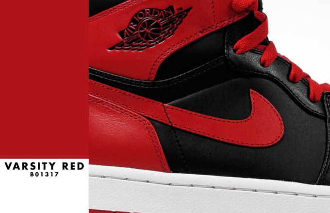
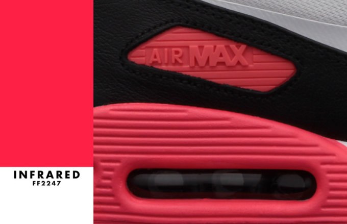
Each sport's palette started from Nike's most iconic shoes. Every swatch was pulled straight from the product.